Recovery Rallies
ARE 2 YEARS, 6 YEARS, OR EVEN 9 YEARS ENOUGH?
Craig Callahan, DBA
March 13, 2018
Soon after the market bottom of March 2009, we stated that the sharp week-long market drop in October 2008 resembled the market “crash” of October 1987. We then began showing graphs comparing market advances following those severe drops. In 2009 and again in 2010 we stated that it would be very reasonable for the recovery from the 2008 crash to resemble, or follow a path similar to, the recovery from the 1987 crash. The latest two updates, which proved quite accurate, were released in June 2015 and April 2017. As it approaches nine years, it appears to us, this current recovery is right on track and has the potential to continue a few more years. Here is an updated version of the report we issued in 2015 and 2017, with time related edits.
The stock market advance that began early March 2009, recently passed the eight-year mark. It seems like almost daily some analyst being interviewed on TV or in print proposes that the end of the advance is near. When we listen closely, we do not hear any specific reasons given. Occasionally an analyst will offer statistics such as the average length of previous bull markets, but overall we sense that their reason is simply intuition that eight years feels long enough. But is it?
As you may recall, the end of the previous bear market and the transition to the current bull market featured a severe drop one week in early October 2008. As the drop spanned six trading days, it was not labeled a “crash.” When graphed using weekly data, that drop appears similar to the crash of October 1987. The graph below shows the S&P 500 Index (using weekly data) set equal to $1.00 on both September 2, 1987 and September 4, 2008. One of the major differences between the two recoveries is that during the early stages of the 2008 recovery the market was battling a recession and traded lower for a couple of months in 2009 before reaching its bottom. Conversely, in 1987 the market was not facing a recession despite many inaccurate predictions of one. Ultimately in 2009 the market rebounded by mid-March and continued on a path similar to the recovery of 1987.
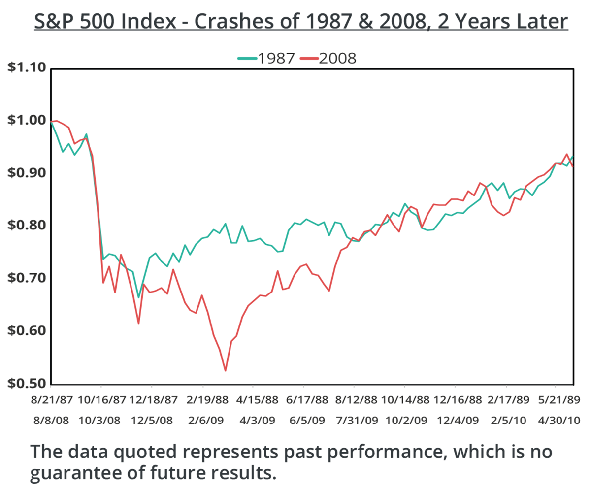
We first showed this graph to audiences in early 2009, suggesting that the market could experience a multi-year post-crash recovery as it had in the late 1980s and early 1990s. On September 18, 2009 we released an article, Was that a Crash?, with a similar graph and stated, “As of September 4, 2009, the ICON valuation readings suggest the market, in general, is priced about 13% below our estimate of intrinsic value. We believe such a reading makes an upward recovery path similar to 1988 and 1989 possible and reasonable.” On April 22, 2010, in a follow up article, Back to the Future, we showed an updated version of the same data and concluded, “[I]n retrospect it seems 1987’s post-crash behavior and recovery is indicative of the recovery we are seeing today. ICON continues to see value in the market and believes that those who remain invested may be able to capture opportunities in the months ahead.”

The graph above shows the same data as the previous graph, updated through eight years after each crash. Looking at the graph we see that on several occasions the Index reached the same value at the same elapsed time since the respective big drops, making the two post-crash recoveries appear quite similar. Lately in April of 2017, the recent recovery is lagging the recovery from 1987.We think it is important to note that both recoveries have also featured “volatility events,” where the market drops in response to an event but then recovers quickly and resumes its advance.
Examples of these volatility events are the European debt crises in 2010 and 2011 and the invasion of Kuwait in 1990.
Can a bull market recovery from a crash last longer than six years? The graph below shows that the recovery from the crash of 1987 continued to the market peak of March 2000, a thirteen year run. This graph also illustrates a second volatility event in 1998, which the media labeled the “Asian Contagion” amid fears that the recession in Asia would spread to Europe and then the U.S.
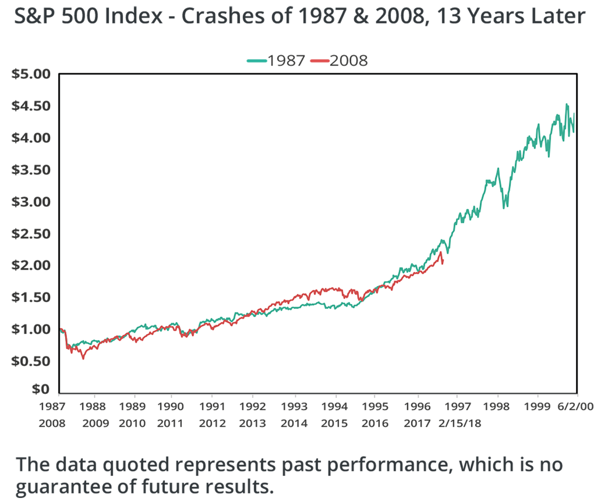
What were conditions like in the mid and late 1990s while the stock market continued its upward march? The U.S. Dollar strengthened, the price of oil was fairly stable, interest rates were declining until late 1998 and 1999, corporate earnings were growing, inflation was low and P/E multiples rose. All else being equal, the P/E ratio* on the S&P 500 Index can be seen as a proxy for investors’ optimism for earnings growth. The more growth investors expect in earnings, the higher multiple they will pay. The last graph below shows the P/E ratio for the S & P 500 from August 1987 through March 2000 and from August 2008 through April 2017. During both periods the P/E ratio generally increased as memories of the crashes became more distant, although the P/E path in the late 1980s and 1990s may have been more volatile. It also appears that the P/E multiple expansion in the late 1990s was a big contributor to the stock market’s advance. Can P/E ratios continue to increase this decade like they did in the late 1990s? Although expansion like we saw in the late 1990s would be simply a continuation of the gradual increase underway lately, we cannot predict investors’ behavior. We just know that one post-crash bull market lasted longer than eight years and conditions and behaviors change over time.

In conclusion, contrary to the bearish headlines, we believe that we are in the midst of a long-term recovery. With our valuation methodology as our guide, we do not see the over-pricing often seen at market peaks. Furthermore, as we saw with the post 1987 market recovery, bull markets can last longer than 8 years. We believe there is still room for market growth in the current environment.
*ICON Advisers does not use P/E ratios for evaluating and selecting investments. Instead, we use our proprietary intrinsic value equation which incorporates earnings, expected growth in earnings, risk and corporate bond yields.

Dr. Craig Callahan is the Founder and President of ICON, and is chairman of the ICON Investment Committee. He is also Portfolio Manager for the ICON Fund and the ICON Opportunites and Long/Short Funds and Co-Portfolio Manager of the ICON Risk-Managed Balance Fund.
The data quoted represents past performance, which is no guarantee of future results.
Opinions and forecasts are subject to change at any time, based on market and other conditions, and should not be construed as a recommendation of any specific security, industry, or sector.
Investing in securities involves risks, including the risk that you can lose the value of your investment. There is no assurance that the investment process will consistently lead to successful results.
Price/Earnings Ratio is the price of a stock divided by its earnings per share.
The unmanaged Standard & Poor’s (S&P) 500 Index is a market value-weighted index of large-cap common stocks considered representative of the broad market. Total return figures for the index assume change in security prices and the reinvestment of any dividends or distributions but do not elect deductions for commissions, management fees, and expenses. Individuals cannot invest directly in an index.
Please visit ICON online at www.iconadvisers.com or call 1-800-828-4881 for the most recent copy of ICON’s Form ADV, Part 2.

